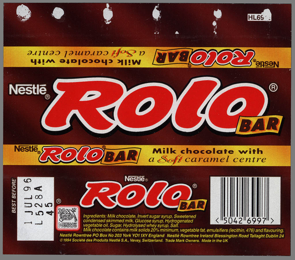
Rolo has been designed using contrasting colors to stand out and help the customer see this candy bar over others. The color scheme works very well together and the red blends well with the brown and gold. The red stands out well on the white stroke and is seen easily by consumers. Since the logo type is duplicated on each side of the wrapper its also very good for brand recognition. The wrapper also leaves a large amount of room on the one side for attaching the two sides together. I think that the design is eye catching, but has too much information on the package for a point of purchase decision. I think that this wrapper style has a very specific market that it is targeting. I really like the way the layout is designed and I like that they found enough room to duplicate the logo on a majority of the sides, but I think that they have over done the information and taken up a lot of space with info about a simple candy bar.
No comments:
Post a Comment