
Thursday, November 14, 2013
20th Century Typography
Why Design Now?

Jackson's

Menu Typography 2

Menu Typography

Wednesday, November 13, 2013
Hard Rock Cafe

Tea Room

Teddy's

Koyo

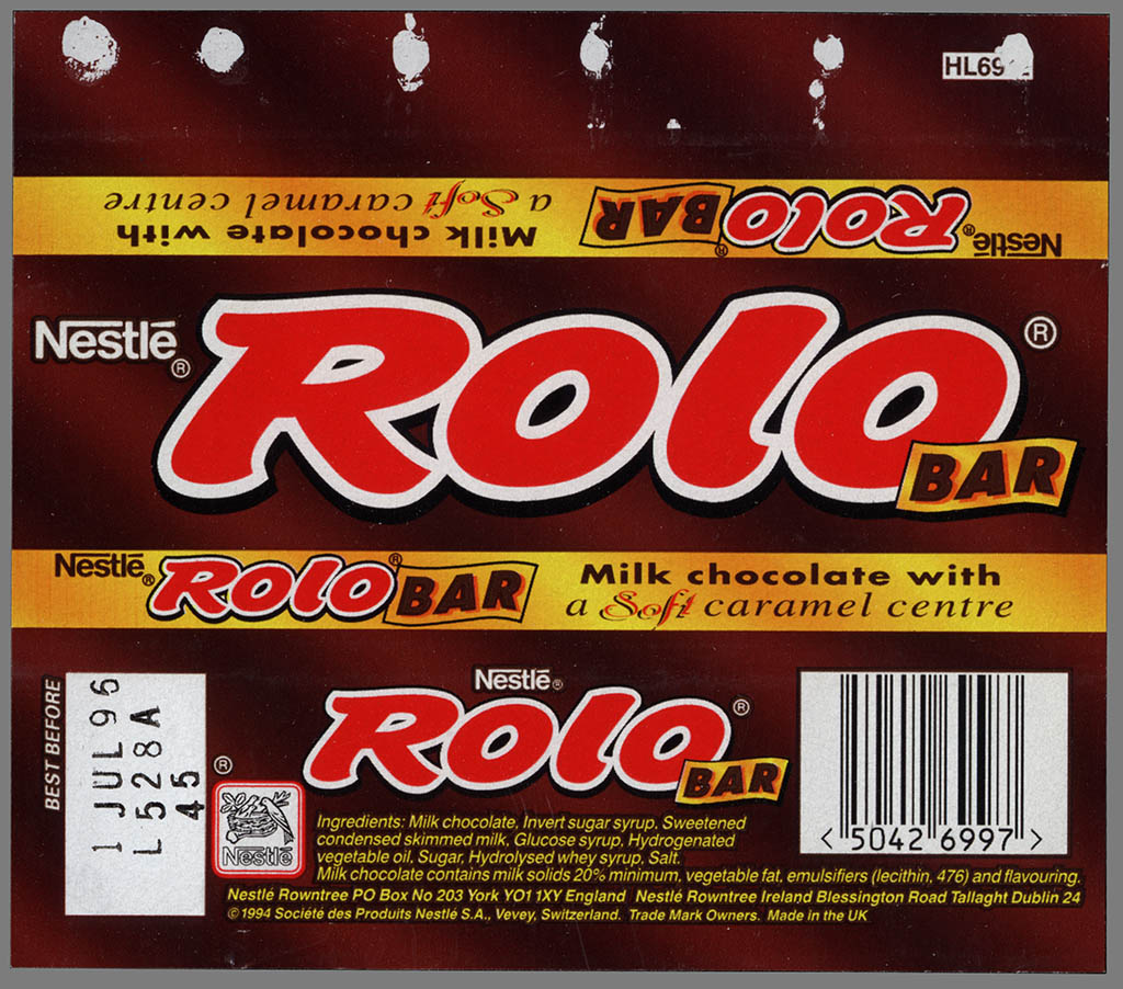
Rolo
Tuesday, November 12, 2013
Snickers Satisfies

Franck Trebillac

Franck Trebillac is a designer in London who has done work for Norton, Hyundai, and even Harley Davidson. He works in print, motion graphics, advertising, art direction, and general illustration. This piece by Trebillac is an illustration of Edger Allen Poe with typography to create his hair and other features. The type is made up of quotes from Poe's works and uses an older curlier font to bring the nostalgic look and feel to the design. There is typographical hierarchy throughout the piece to show important quotes and to make Poe's name stand out. I think that the words "a dream" are out of place being the same size as "Poe" and makes it look like the piece says "A Dream Poe". I think that if the area that had "a dream" was full of other quotes it could add to the interest of the design, while also taking away the confusion of the type. There is a problem with the spacing of the type within the eyes. The eyes does become covered by some of the actual image and is harder to read. This could easily be fixed by just playing around with the sizing and positioning of the type, but unfortunately it was not fixed. As the type comes closer to the neck there is some more covering of the type which again could be fixed. I think this is a very cool concept and I like the font choice, but I think this could use a little more work.
Glenn Wolk

Monday, November 11, 2013
Am I Collective

Teagan White

Nothing Can Stop A Good Idea by Mauro Hernandez

Typography

Wednesday, November 6, 2013
Thomas Price

Zombies

This typographical illustration is by designer, Sion Lee. She is a mostly a website designer with such websites as, The Awesomer, Not Always Right, and Ubiki. This design is the image of a human hand turned zombie and is recreating the very well known scene of a zombie hand reaching up. This hand is made entirely out of text and features references to 978 different zombie games, movies, and books. There is a lot to say about the uniqueness of this piece, but the design is fantastic. The shading and use of different colors and shades creates depth and implied textures. The green helps show decay and show that this is a zombie hand and not a regular human hand, the white shows where the bones are, and the red shows the muscles and where the skin could even possibly be torn off. The direction of the type creates motion and helps guide the eyes of the audience very well and brings their eyes through the entire piece. Using font variation helps bring interest in and makes people look closer and study the piece for a longer time. This is an awesome design!
Tuesday, November 5, 2013
Great Value

Subscribe to:
Comments (Atom)