Tuesday, October 29, 2013

Poland Spring Water


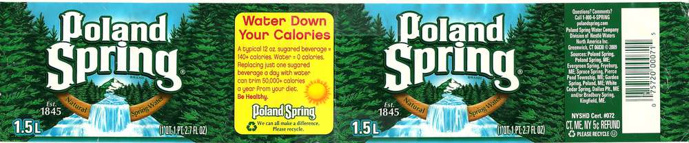
The Poland Spring water bottle label is a very complex example of display typography. There is so much going on in this design that it is hard to keep the eye focused on the brand. The majority of the design is green leaves with dark details. The middle of the illustration is a river of rushing water that creates motion and eventually shows the horizon line differentiating the focus from the background. Once the consumer looks closer at the design they notice that there is a mountain in the very background under the brand name and the river and in-between the dark green trees. There is also a curved bar that is in the middle of the image. The illustration alone is hard enough to look at, but then there is the typography. The brand type stands out in white and contains the same green as the trees in its stroke to create consistency; that being said, the type has many issues. The upper-case letters in the type are oddly shaped and even appear pointy and hard to associate with water. The only way I would describe this upper-case type while talking to another designer is that it is a serif font that has serifs on its serifs. Another thing is that the lower-case "g" looks like someone cut off the ascender from a letter "d" and added a curly tail to the bottom. In the side box is a red on yellow paragraph of left justified type. First of all they red on yellow type does stand out, but it vibrates too much and hurts to really look at. The headline for the side box is center justified, while the body copy is left justified. This justification issue throws off the consistency for this area of the design. Lastly the distribution facts are bunched in a slim box that looks like it was thrown in at the last minute. While this design might have a eye-catching white title, which is a plus for display typography, it lacks many common typographical elements that could make this much more appealing to the consumer.

Tuesday, October 22, 2013

Dr. Pepper

Dr. Pepper has a very consist ant bottle wrapper design. They usually tend to stay with the same color scheme; even for different flavors of soda. They mostly use different shades of red to create depth while maintaining a monochromatic appeal. I think that using brighter reds for the logo works to bring the logo closer to the consumer; while the white type provides contrast and definition. In their layout they put the main logo in the middle of the design, the side box material on the left, and the nutrition facts on the right side with the barcode. I think that this is a very well thought-out layout. This allows enough room for the design elements, while still maintaining enough room for nutritional facts and barcode. I think that even if this is not exactly how my work would be printed, I think it is a great way to at least layout the thumbnails so that all of the detailed info gets enough room and acknowledgment.

Monday, October 21, 2013

Coke

Coca-Cola is possibly the best known soda in the world and has been part of some of the best marketing campaigns around. The very simple script font is known as their logo and provides immediate recognition to what brand of soda it is. They use a contrasting color combination that provides recognition and is easy to notice even from a distance. even the small type looks readable in white and stands out well. Having the nutrition facts in white helps keep consistency throughout the piece and helps provide continuity. In the recycling details they made key words and logos green to stand out and show that they are eco friendly and support "going green" and support recycling efforts. I think that Coke is always a great example when it comes to designs and marketing.

Fanta

Fanta has a very noticeable bottle label due to the bright colors and interesting design. The main thing that I think Fanta does right with their designs is that they have their main color that represents the flavor of the drink, but they use another very different color that creates contrast and provides attraction to their audience. The label above uses different shades of orange to show the consumer right away that it is an orange flavored soda, but then they used blue for the logo to create contrast and make the logo "pop". This gives the first impression that it is an orange flavored drink, while a split second later giving the detail to what brand it is. If this had just been a black logo on an orange background it would have seemed boring and would take longer for the consumer to realize what brand it was. The nutrition facts remains black but this is secondary on the typographical hierarchy and is easy to see and has a high readability level. I think this is a very well done design and the orange Fanta label stands out to me when I go looking for a drink

Dasani

Dasani's water bottle wrapper has a simple two-toned design. While this does like nice for a general product design, this is not very eye-catching from a distance. To be honest I would know from a distance that this is a water bottle label because it is a very generic look and is very similar to what we see on a usual basis when thinking about water, but from a distance there is no way of knowing what brand of water this is. At that point i'm going to go up to it because I know it's water, not because it's Dasani. I think that the colors work well together but don't have a high enough contrast to really stand out or create any appeal. Also the lighter blue doesn't look very good as a stroke on the type. This actually makes the white type harder to read and makes the smaller type look too cluttered. Also once the text heavy side is seen without the logo, it can become very crowded and seem like a big splotch of white and light blue. I think that if there was possibly a lighter background and darker type then it wouldn't need a stroke for contrast and the darker logo and text would stand out more.

Monday, October 7, 2013

Capture The Flag: The Stars and Stripes in American History


Capture The Flag: The Stars and Stripes in American History by Arnaldo Testi has a very interesting design. The title creates the American flag by using left justified type. The designer separated the main title by placing it within the blue square of the flag. This looks good but I think I would have made the word "Flag" bigger than the word "The". This would add emphasis to the flag and would make the subject matter even more defined. I also think that one problem about this typographical image is that the font is left justified and the lines of text don't align at all. This is understandable since there are not many words in the title, but it does look sorta like a torn flag. This is a very simple design that still makes a point. There are really cool design ideas that are simple but still make a intricate design that makes people think. This shows that simplicity is still a great element of design and that it should not be overlooked. Over all this is a great design and it makes the cover feel professional and uniformed while maintaining simplicity and clean colors.


Steve Jobs Typography by Dylan Roscover

Steve Jobs by Dylan Roscover is a typographical portrait of Steve Jobs himself. This is a very cool illustration and using typography to create a portrait of someone is awesome. Portraits sometimes show meaning within the person and what they stand for and are thinking. Using type to create a person's face allows emotion to be seen in the subject's natural expressions, and it allows the language of the type to express thoughts or ideas in a clear and concise manner. One thing thats different about making a portrait is that the type needs to be in different shades to create depth and texture. After zooming in really close I found that his facial hair is actually made out of parentheses and 1's. This is a really nice touch and it looks really good. The design is not 100% text, but the majority of the portrait is made from type and shows great typography skills. This looks like it takes a lot of time to create, but the devotion that it also takes makes the results worth the time and effort. This piece also has a lot of hierarchy within it by making some of the type larger than others, even if it doesn't fit that part of the image. It works really well and it helps to show which quotes and thoughts are most important or had more meaningful.

May The Force Of Typography Be With You

May The Force Of Typography Be With You is a great line of posters that shows how to create images out of the outlines of text. Each shape used to create Darth Vader's face is actually a different character. Another great part of this piece is that it uses multiple fonts to create the perfect shape. At the bottom of the page is a list of which characters were used, how many, and what font. This design, and the two other Star Wars designs, were made by a design company in Italy called H-57. This piece is very simple and doesn't have too much complexity, but it reminds me that creating an image out of text doesn't mean you're restricted to using just one font. The rule of fonts is that there should be no more than 3 different fonts in one image, but this seems to be the exception to the rule. This is a great design and changes the way I see shapes and objects. Now I can look at something and start to image what fonts and font variations can I use as building blocks to create new designs and objects. I think that typography is suppose to express a meaning through language, but this shows that it can also be used as an art.

TitanVex

TitanVex is a very small design company who works in illustrations, websites, prints, videos, and fonts. They do not show too many of their clients on their website, but they do show a lot of their design work. They are not just designers, but also nerds, and that reflects well in their gaming illustrations. TitanVex has an entire section on their website that shows off their different gaming inspired typographical posters. This poster has quotes from the popular Assassin's Creed games. I really like this poster and the idea of using quotes to create familiar logos and shapes. One thing that stands out to me about this piece is that there are many different font sizes throughout this one image to show which words are more important. Just by making some words larger, they have created emphasis and it makes it easier for a person to read. Making the key words of emphasis larger also helps to bring interest to the piece. As people see the bigger, more intense words, they begin to look at the smaller words, and eventually they read the entire work. I think that this is a very cool design and I like the use of color and font sizes. The legibility of this piece does make this a harder piece to understand, but I really like the use of hierarchy to create emphasis and draw attention. I like this work and I think it is a great reminder of how to make typographical illustrations not just lines of text, but also a story inside of imagery.

A Study In Scarlet

A Study in Scarlet has a cover that is interesting on both the front cover, and the back. The front cover has a very cool typographical image that portrays a fingerprint. This image is not made from one line of text or just one word, but it actually contains many different words and is split apart to create a better shape. The different words have to do with the story and of Sherlock Holmes. Within the fingerprint are a few key words like the title and the author's name. These key words are found in bright orange and help to distinguish which words are important or not. This is a really simple and eye pleasing use of typographical hierarchy. On the back of the book is a small synopsis in grey and a slightly larger quote about the book in the same orange as the cover. I really like this idea of having the quote in the same color as the title and author's name because it shows that the quote is also very important to the book. The back also has a fingerprint in the design, but this is just an illustration, not typographical. On the spine of the book is the title, author name, and publisher's logo. I like the way the spine is aligned because when the book stands up you see the title first, but when the book is laying down you read the author's name first. This means that both the title and author get their recognition while the logo is still really recognizable. I think this is a very well done cover and I very much like the idea of making a design out of grey text, but making key words stand out with a brighter color. I already own a copy of this book, but I would possibly buy this copy just for the look and design.

Sunday, October 6, 2013

Hemlock Grove

Hemlock Grove is one of those book covers that has the majority of the type running vertically but actually makes it work well with the illustration. The cover creates has two main objects, one illustration and one typographical object. The illustration is an arm coming down from the top of the cover and reaching into the lower half of the page. The typographical object is a large "H" that contains the title and author's name. There is a great use of negative space. The "H" is also cut from a semi-opaque red box that makes the "H" shape the natural color of the sketch. This is a great use of type to create focus. I think that when you first look at this cover you notice the "H" shape and begin to focus on the name of the book, but after you have done that your eyes move onto the image of the arm coming down from the top of the page. I really like the idea of using this semi-opaque shape to merge the type with the image without changing the image itself. I think this concept could be used in many different outlets. This typographical technique could be used in flyers, websites, advertisements, and of course books. I really like the look of this cover. The only change I might make is that I would try using a more classic font, possibly a serif font. Even without a change to the font I think that this is a really cool cover and I want to try the use of negative space to create objects in my own work.

Every Love Story is a Ghost Story: A Life Of David Foster Wallace

Every Love Story is a Ghost Story: A Life Of David Foster Wallace has a very interesting book cover. The cover features the name of David Foster Wallace, but has diagonal cuts within it to provide space for the beginning of the title. This is a cool idea, but I don't know if it really works for this book. First of all, when I see a large block of text that happens to be a name of someone, I assume that they are the author. It wasn't until I looked a second time that I found the author's name at the bottom. After that I found that the text within the name was actually the beginning of the title. I could understand if that was the tagline after the name David Foster Wallace, but it actually comes before that. Another problem with the way this was done is that the spaces cut out are uneven. This makes the spacing appear off. The first two names has three cut outs for additional text, while the name Wallace has only one. This throws off the balance and makes the "W", "A", "C", and "E" look more important than the other letters. At the bottom is the author's name. The author's name is much smaller and creates a top-heavey cover. This is a very interesting cover, but I think that it is too hard to read the first time. Even though I personally don't like it, I have to honestly admit that It will attract the eye of someone who notices the difference to this font and that person is more than likely to take the time to investigate the book more.

A Year from Monday


A Year from Monday is a book of lectures and writings from John Cage. The first thing that comes to mind when I look at this cover is boring, but it might not be as boring as the grey and black color scheme makes it first appear. To start, the book illustration does cover both the front and the back while connecting at the spine. The illustration is simply John Cage's initials sized to fit the cover. The "J" and the "C" are both in different shades of grey and tilted to create balance in their bottom curves. The title is very interesting and stands out well. There is hierarchy found in this title by putting the word "year" inside of the illustration and not just making it a lighter shade of grey, but going all the way in the other direction and making it a bright clean white. This makes the word "year" stand out as an important part of the title. The next type to follow are the words "From Monday" and the author's credit. Both the last half of the title and the author's name are in a thin sans serif font that keeps flow by staying in the sans serif family, while showing division by staying thinner in weight. There is also balance and proper alignment by aligning the barcode on the back with the title on the front. The only things that I dislike about this are that there is no text on the spine for recognition and that the colors are very boring. Even though I think the colors are kinda boring, after looking at this cover more I am starting to see that it is going for a more simplistic, sophisticated look that black, grey, and white can give. I think this cover works well.

Making Ideas Happen

I really the cover of Scott Belsky's book, Making Ideas Happen. The illustration is a puzzle piece design that incorporates the idea of putting things together to make ideas work. All of the main title is in a large sans serif font that is left side aligned and takes up over half of the cover. The left align style for a book cover can create empty space, but in this cover they added a tagline in three black lines. The tagline is also in a left alignment, but since it is a smaller font it fits directly into the empty space of the title and looks great. Below the title is the author credit. To bring the black background fully throughout the piece, the black line and white font is underneath the author's name and displays the author's title. This creates balance in the color. Also there is balance between the title and tagline, and also the author's name and personal title. The bigger white letters and smaller black boxes makes the top feel balanced on its own, and the bottom balanced on its own. There are also missing puzzle pieces near the text that says "overcoming the obstacles between vision and reality". This could just be to create difference in pattern, or it could be another way to attach the meaning of those obstacles and the missing pieces required to complete them. I really like this cover and I like when the title can be large simple text, and the cover is still exciting and appealing. 

Biodiversity

This book cover for Biodiversity: The Era of Extinction is mostly typographical and brings some interesting elements to a book cover, but not all of them are positives. The hourglass shape and using different animal species as the sand helps to create the imagery that living and thriving species of animals, after time and pressure, are going to slip through the cracks and become extinct. I also like that the falling type is transformed into different waves to create motion and that it also makes a pile of sand at the bottom. While this illustration and use of altered text helps to create a story, the cover has some flaws. There are more than three different fonts within the hourglass itself, while there are still two more fonts outside of the hourglass. Also the font used for the "biodiversity" looks fine, but the "the era of extinction" is hard to see and looks like its being destroyed. This look could be what the designer was going for when he or she created it, but does not fit with the rest of the piece or the other fonts. I think that if the tag line had a better looking font that maybe had some grunge element to it, the piece would fit together a little better. Another thing that I don't like about this book cover is that there is no mention of the author. One of the biggest selling points for a book is who wrote it. With some different fonts and the author's credit, this could be a very good cover that would show the reader exactly what they are reading about before they even turn to the first page.