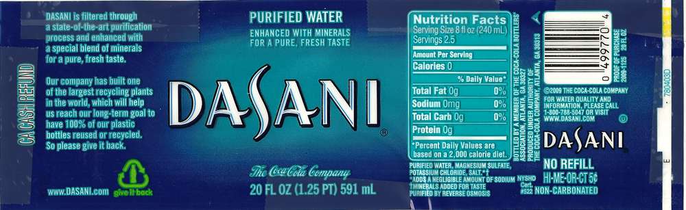
Dasani's water bottle wrapper has a simple two-toned design. While this does like nice for a general product design, this is not very eye-catching from a distance. To be honest I would know from a distance that this is a water bottle label because it is a very generic look and is very similar to what we see on a usual basis when thinking about water, but from a distance there is no way of knowing what brand of water this is. At that point i'm going to go up to it because I know it's water, not because it's Dasani. I think that the colors work well together but don't have a high enough contrast to really stand out or create any appeal. Also the lighter blue doesn't look very good as a stroke on the type. This actually makes the white type harder to read and makes the smaller type look too cluttered. Also once the text heavy side is seen without the logo, it can become very crowded and seem like a big splotch of white and light blue. I think that if there was possibly a lighter background and darker type then it wouldn't need a stroke for contrast and the darker logo and text would stand out more.
No comments:
Post a Comment